IREN IREN IREN IREN
THE CHALLENGE WAS TO RENEW THE IDENTITY OF THE BRAND IN OCCASION OF THE NEW POSITIONING.
FROM
The electricity and gas provider in North Western Italy with no specific brand differentiator.
TO
A National multiutility with people’s expectations at the core in an era of big evolution.
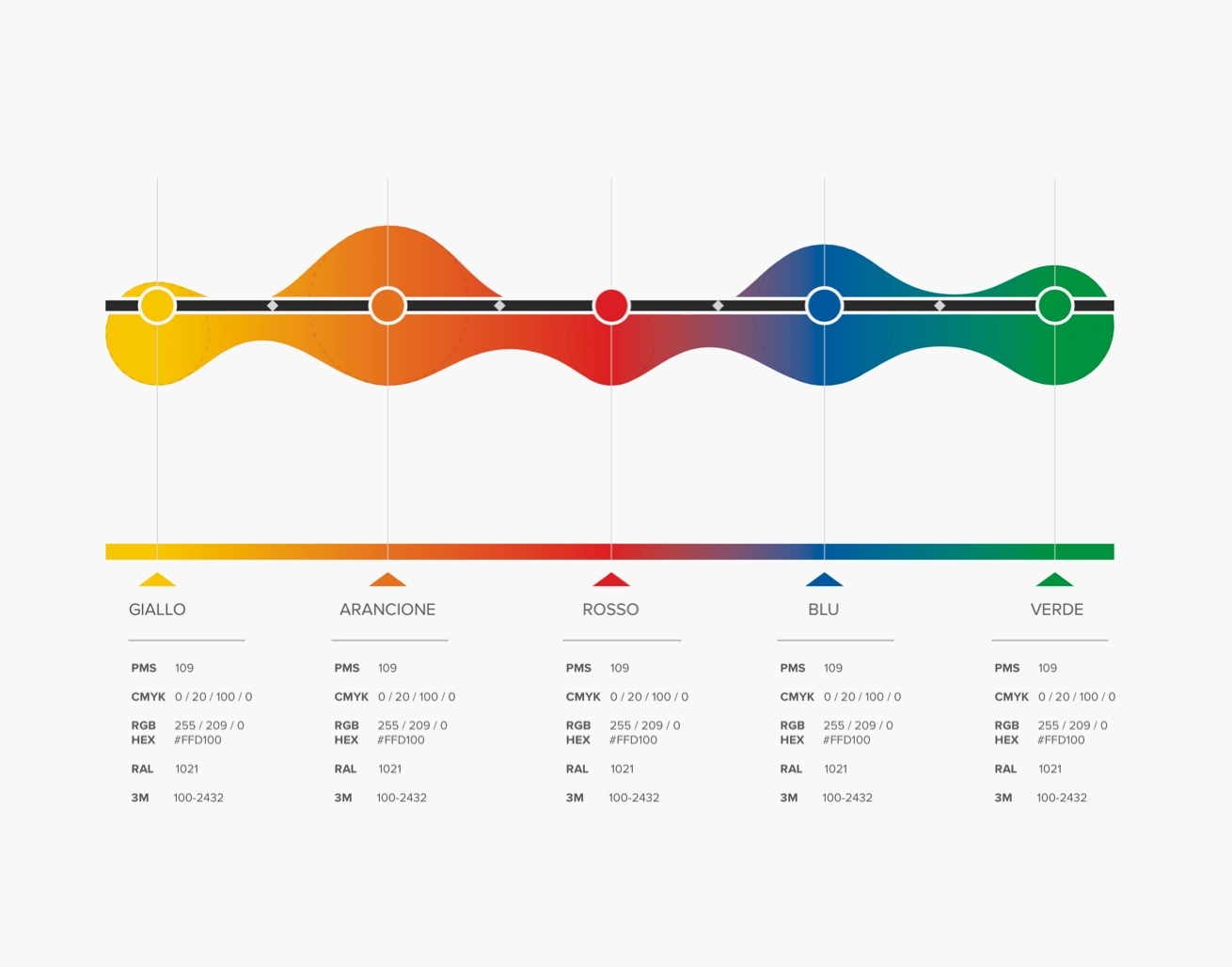
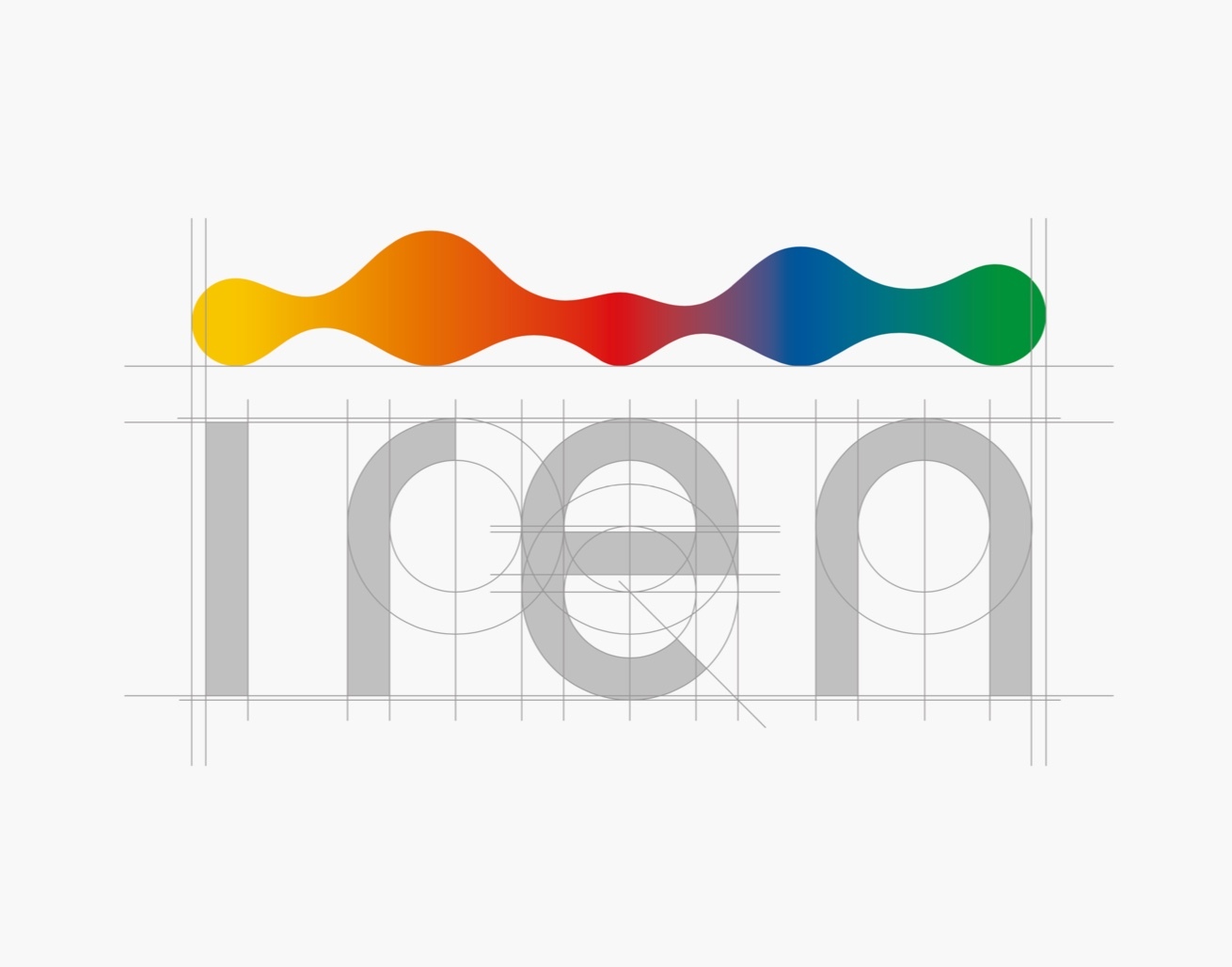
Logo design
The new logo is meant to express - thanks to the gradient colors and the dynamic shape of the pictogram - the feeling of continuous transformation and adapation of the brand towards people and communities’ expectations.
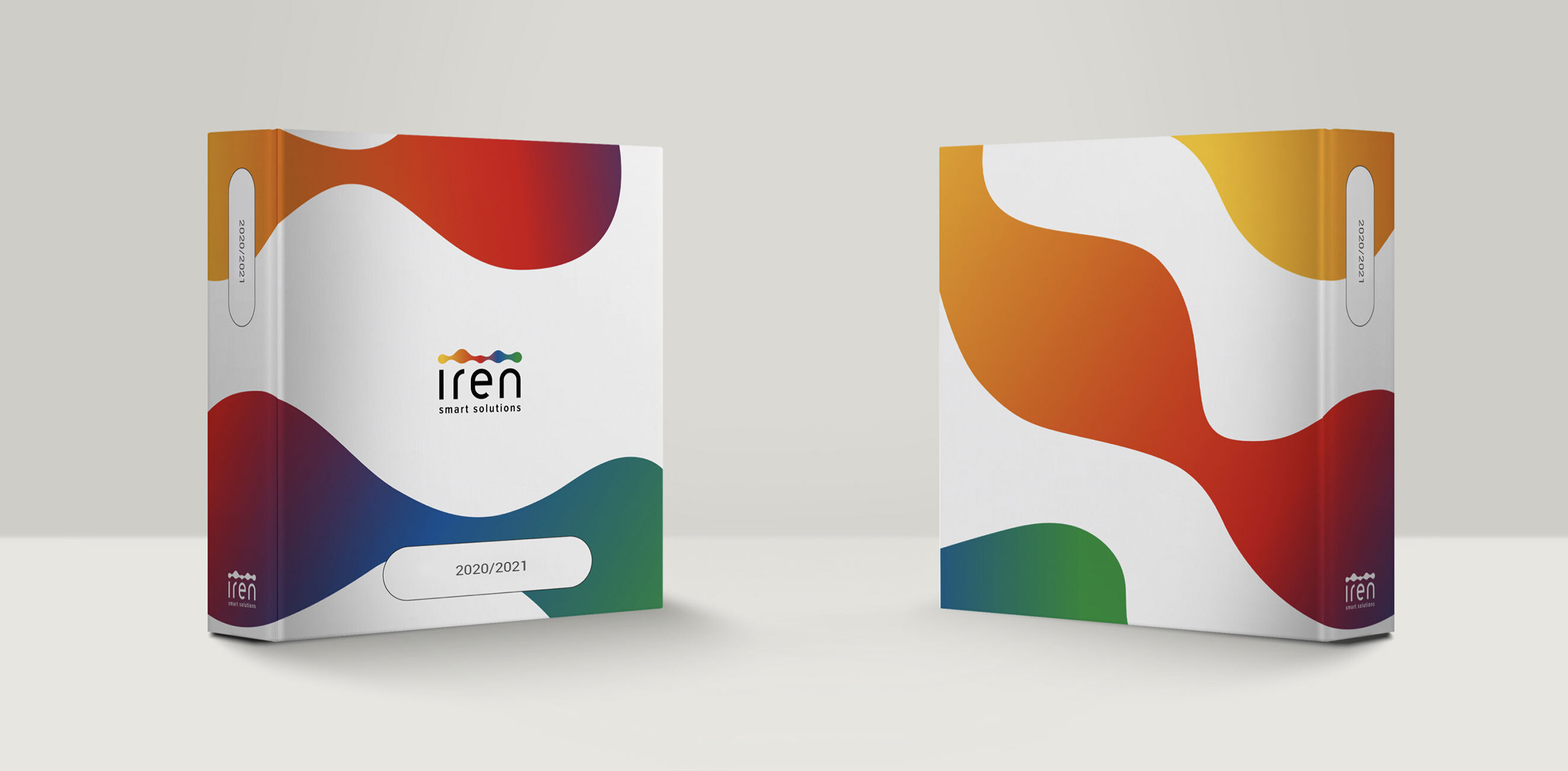
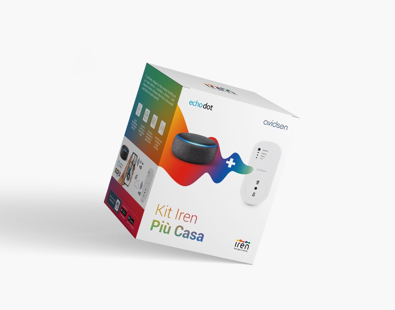
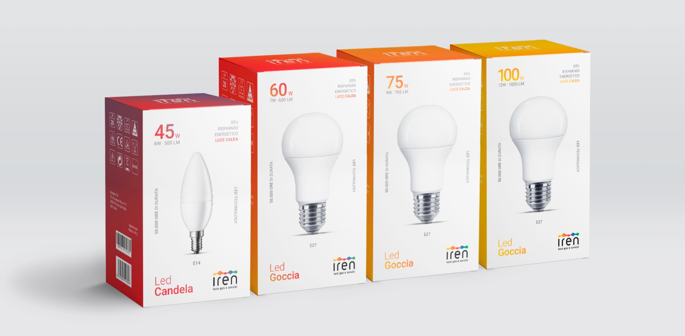
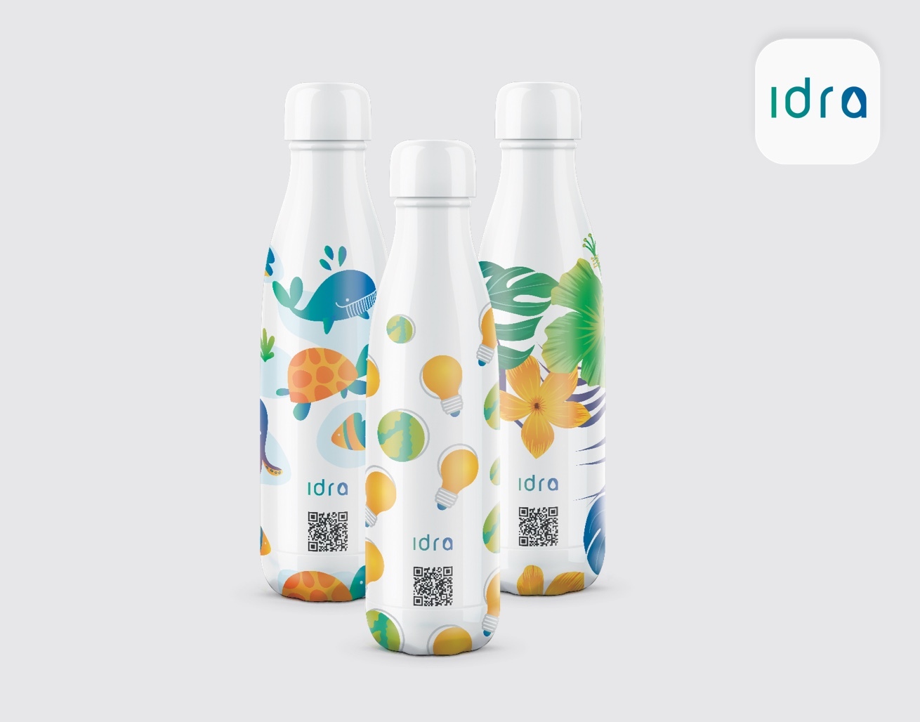
Packaging Design
The identity is given by using of the gradient colors and / or sections of the pictogram shape.
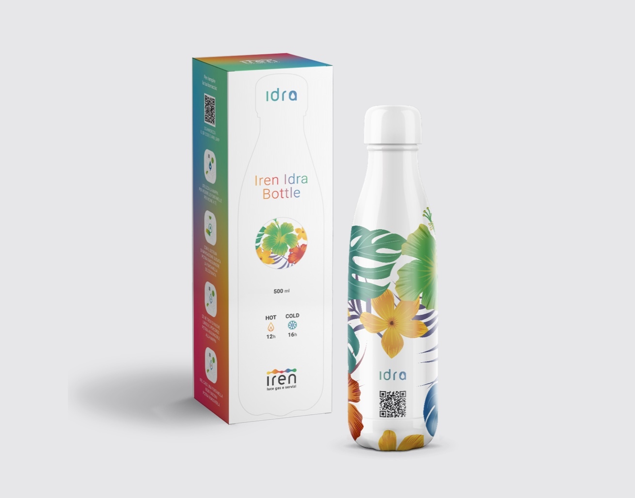
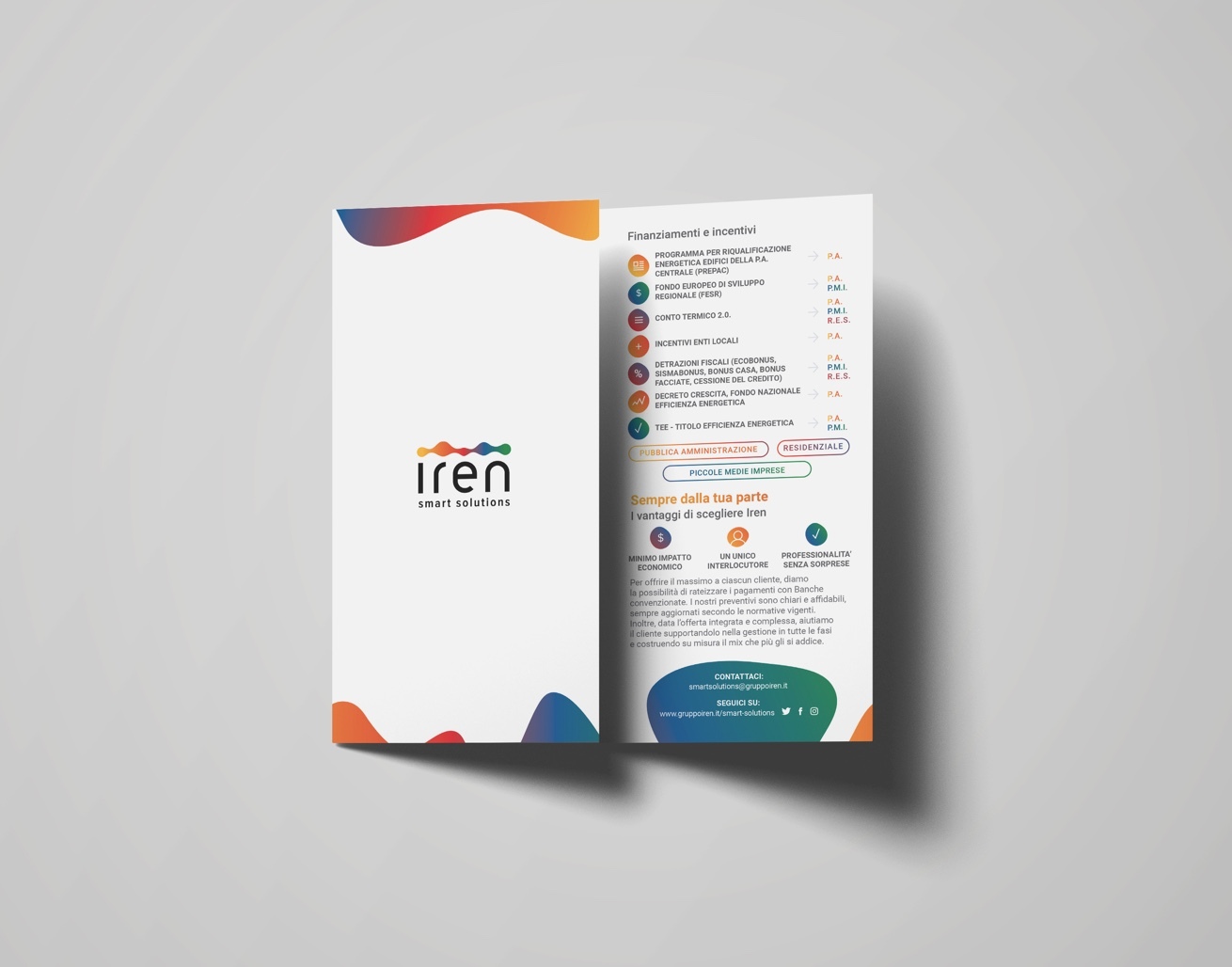
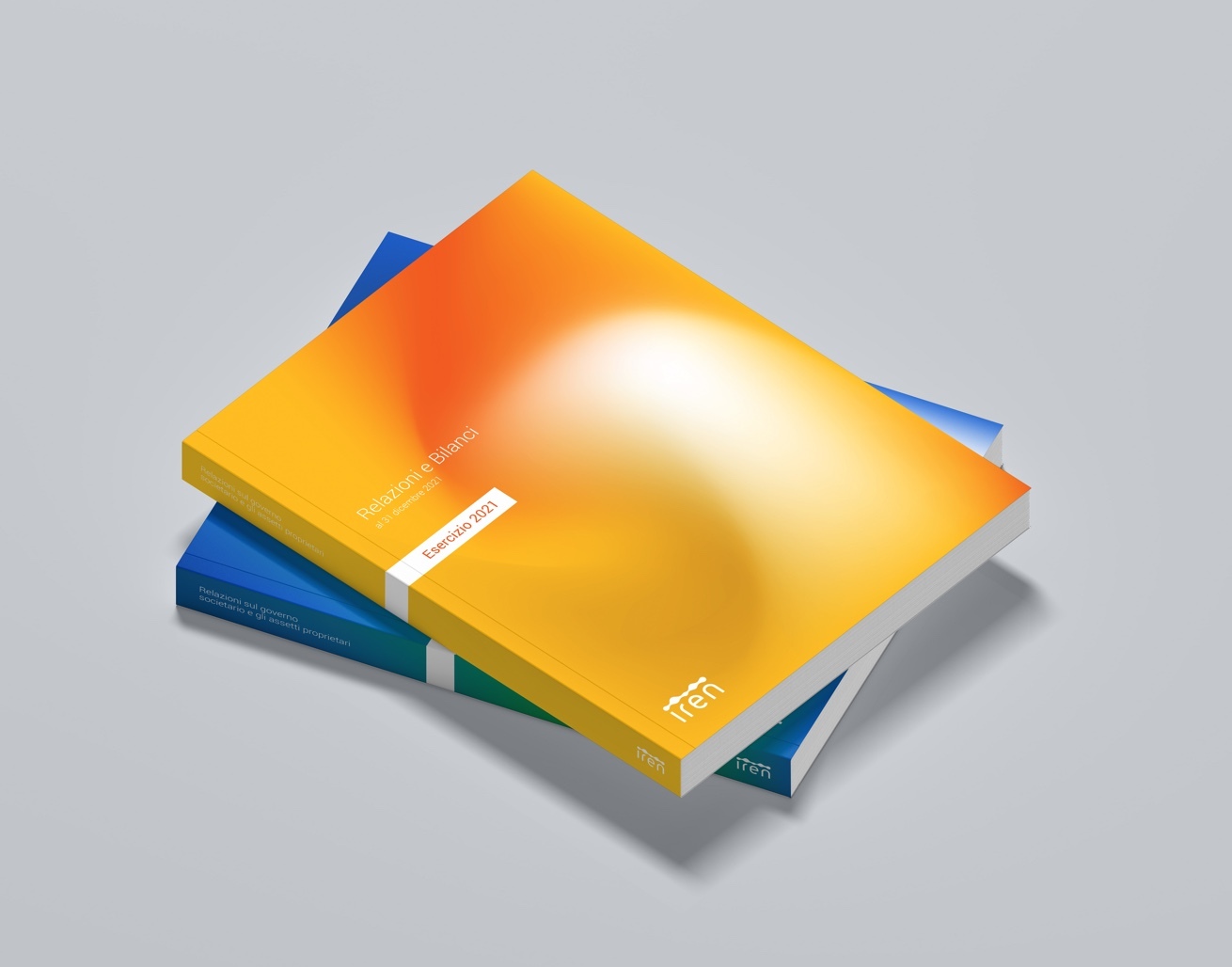
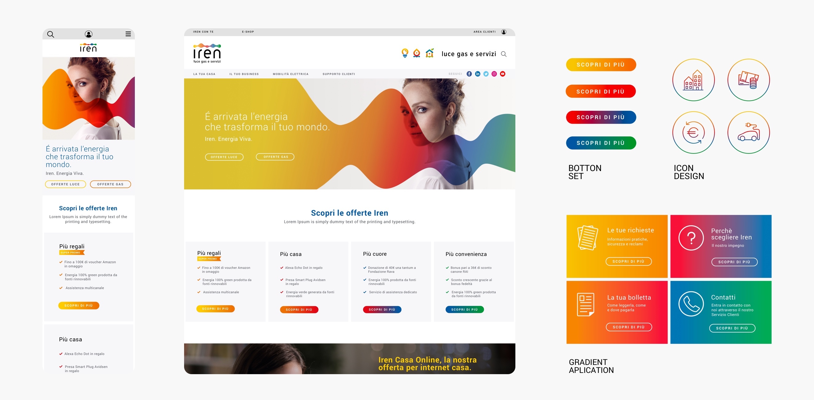
Visual consistency among
all the developed touchpoints.